Student information portal - for University Students
Project scope
Overview
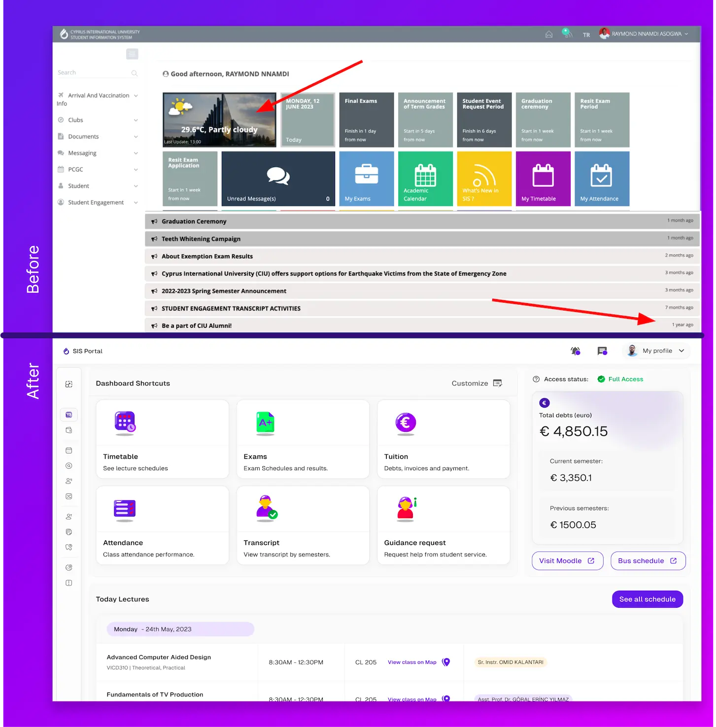
Redesigning a legacy product can be a delicate task, but I grew tired of seeing outdated notifications and an irrelevant weather widget in my student portal, so I decided to take action.
Beyond that, there was a deeper reason why I took on this project.
Problem
Additionally, 75% of users utilized that time primarily to check their timetables, with most doing so on their mobile devices. This insight clearly highlights the need for improvement, particularly in providing immediate access to the essential features that users rely on daily.
Research tools & methods
Analyzed website data and user interactions to gain insights into user behavior, website performance, and overall online effectiveness.
Conducted interviews and surveys with students and faculty members to identify pain points and needs.
Engaged students to categorize and organize information or items into groups to reveal patterns and preferences.
Solution - The goals were simple
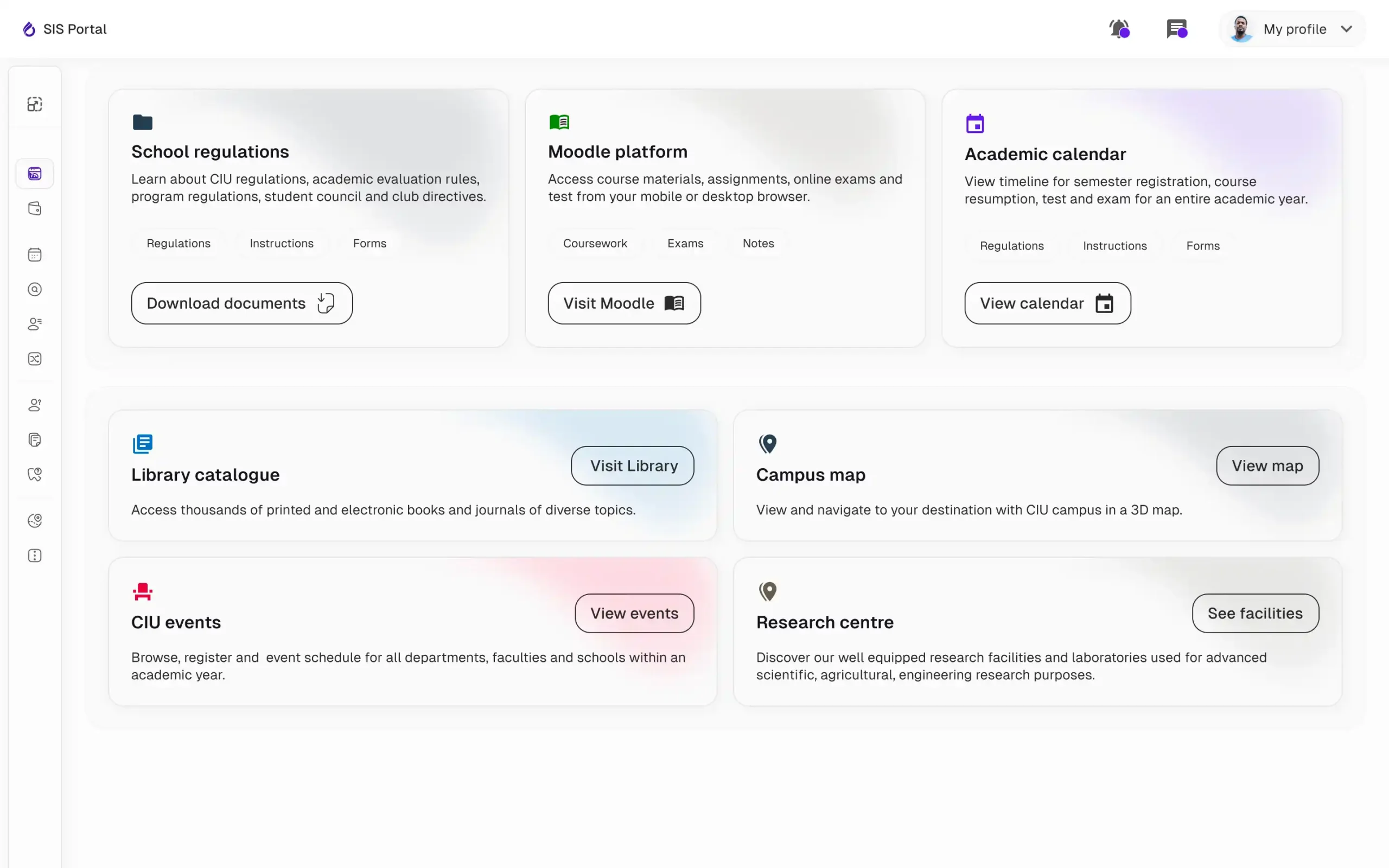
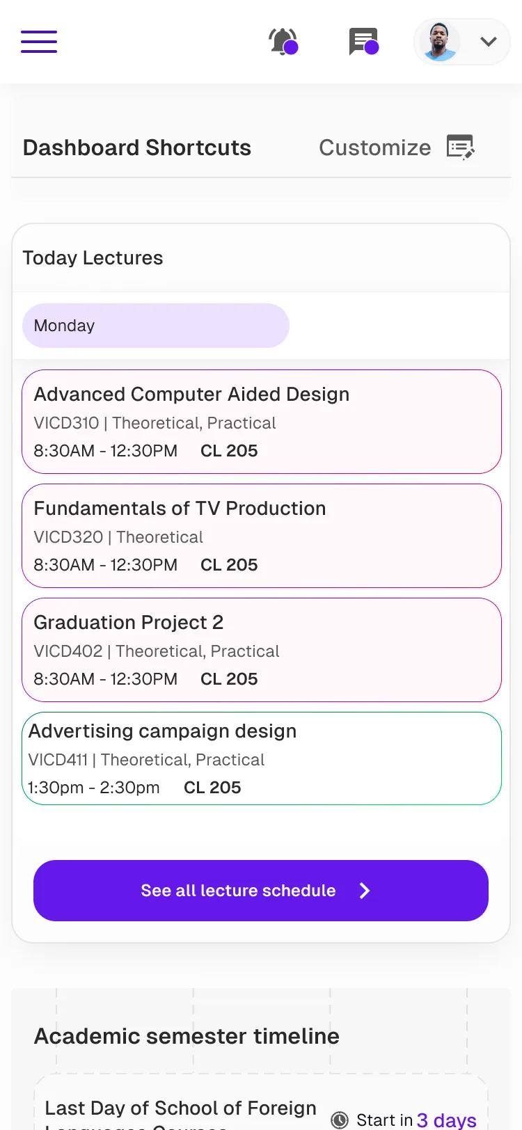
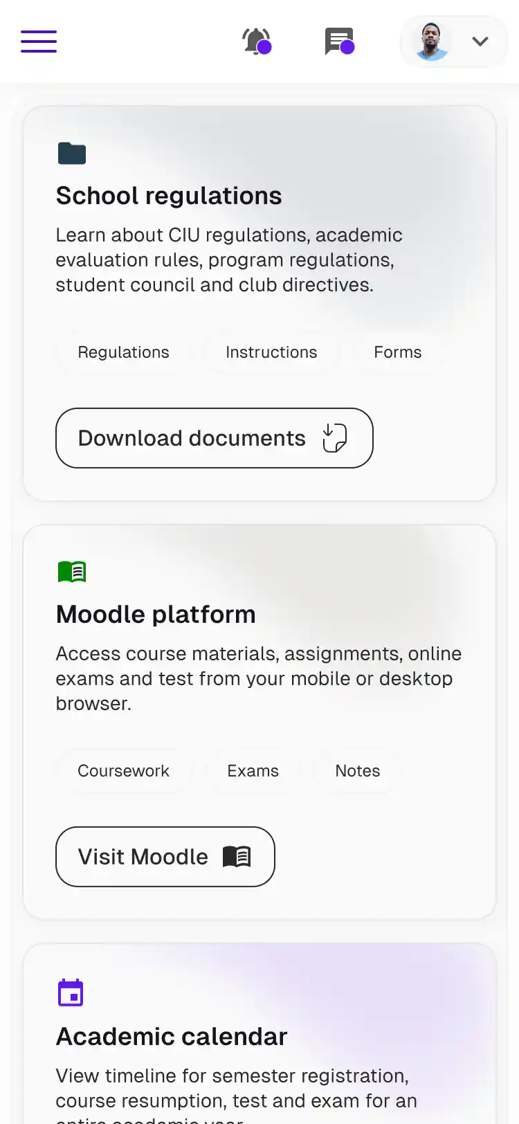
Deliver a mobile-first experience with intuitive design, optimized for seamless access and performance on any device."
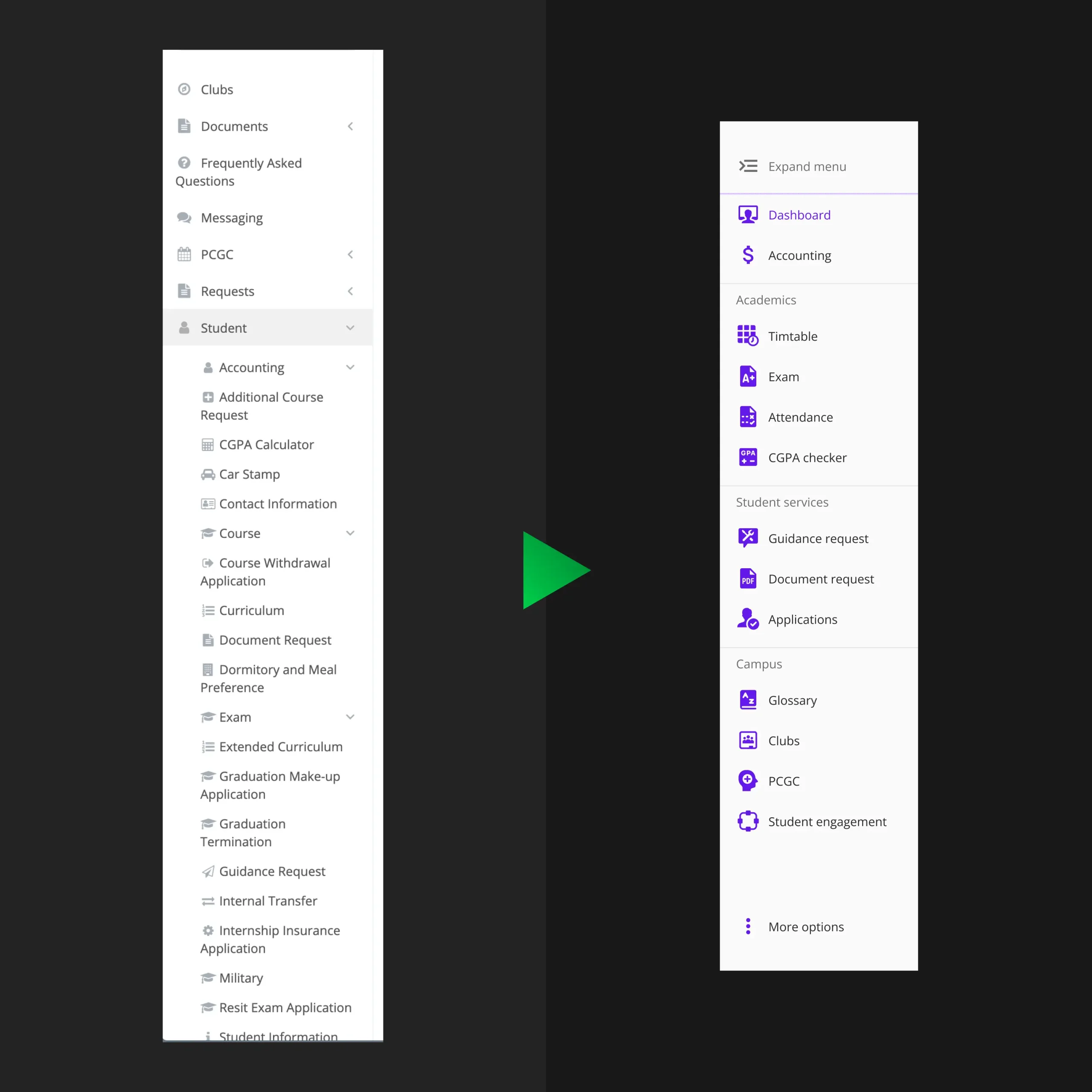
Offer streamlined navigation, refined through card sorting for effortless access to key features and information.
Minimize cognitive load by organizing the dashboard, navigation, and pages into clear clusters, making it easier to find and process information.
Design an accessible and functional UI that balances ease of use with practical features, ensuring a smooth experience for all users across desktop and mobile.
How did I turn this insights into solutions?
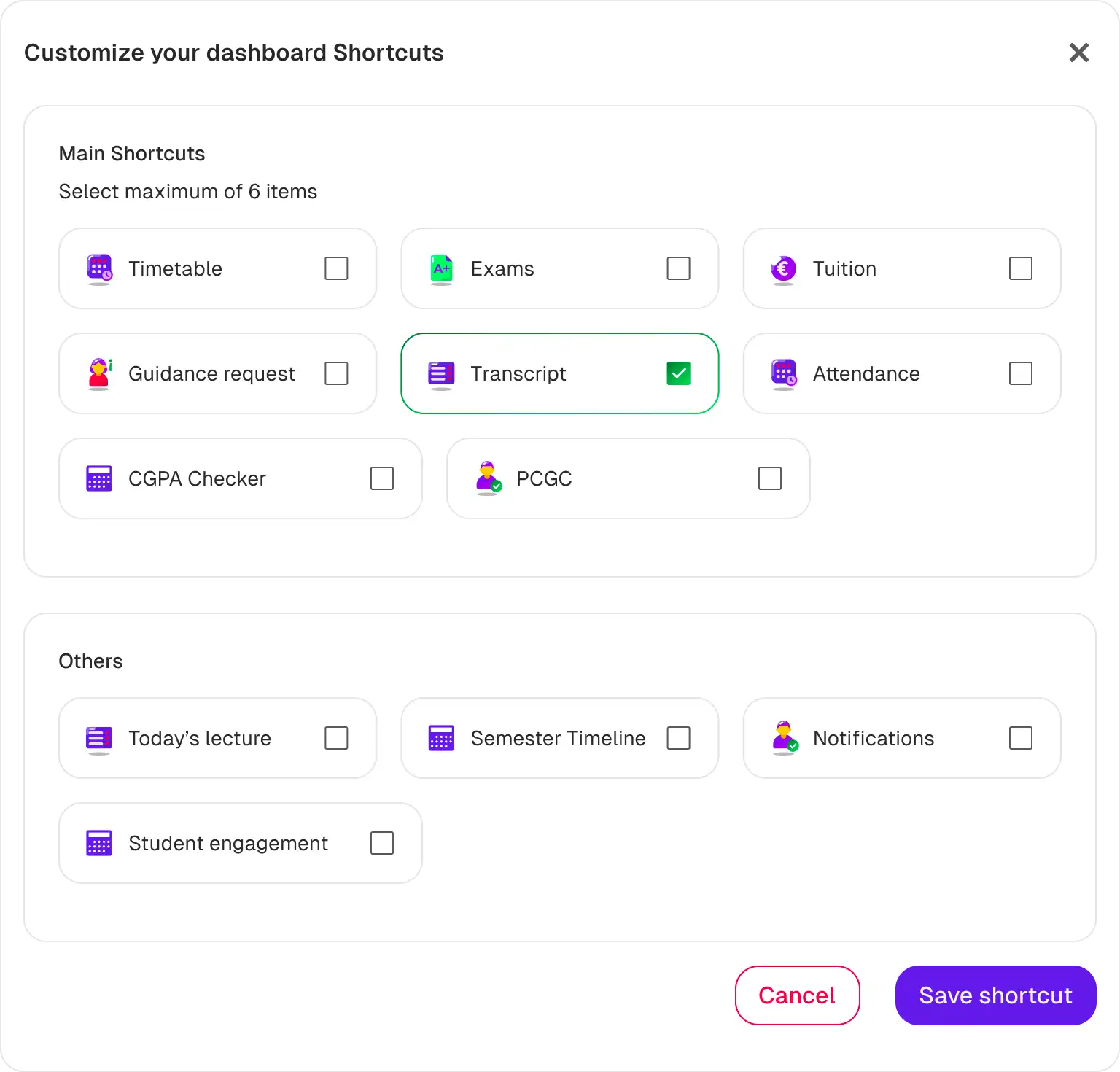
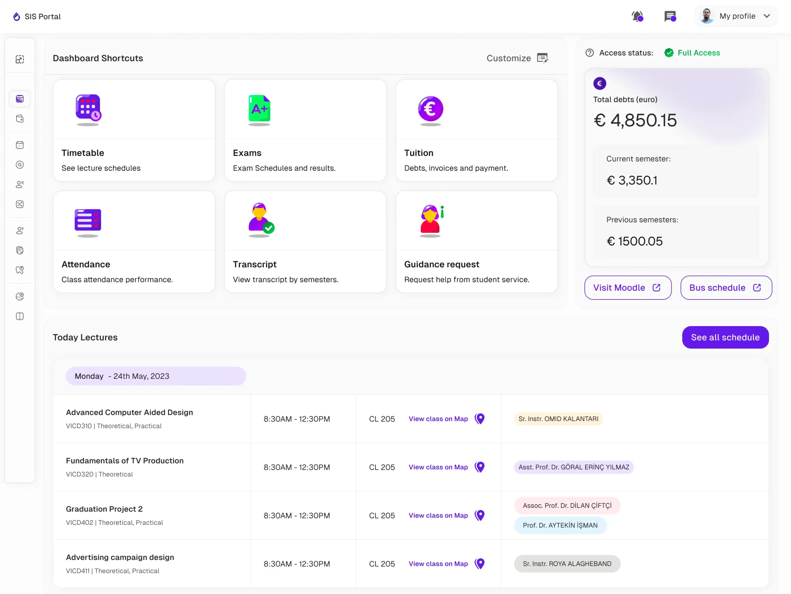
Actionable dashboard
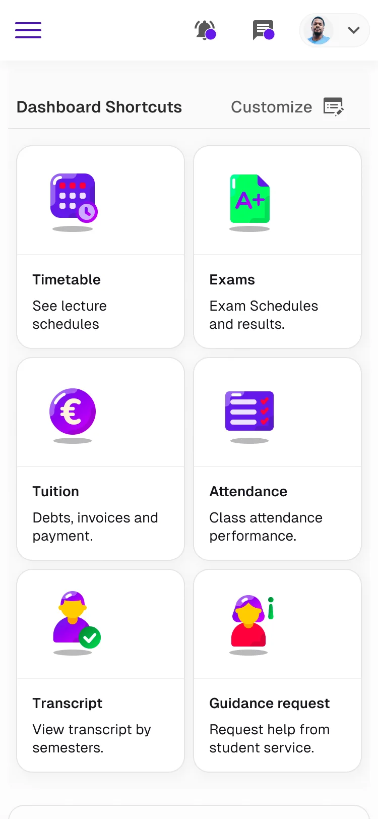
A complete redesign of the dashboard, featuring shortcuts to users' most frequent actions and customizable options to tailor their experience, ensuring a seamless and consistent interface across all devices.

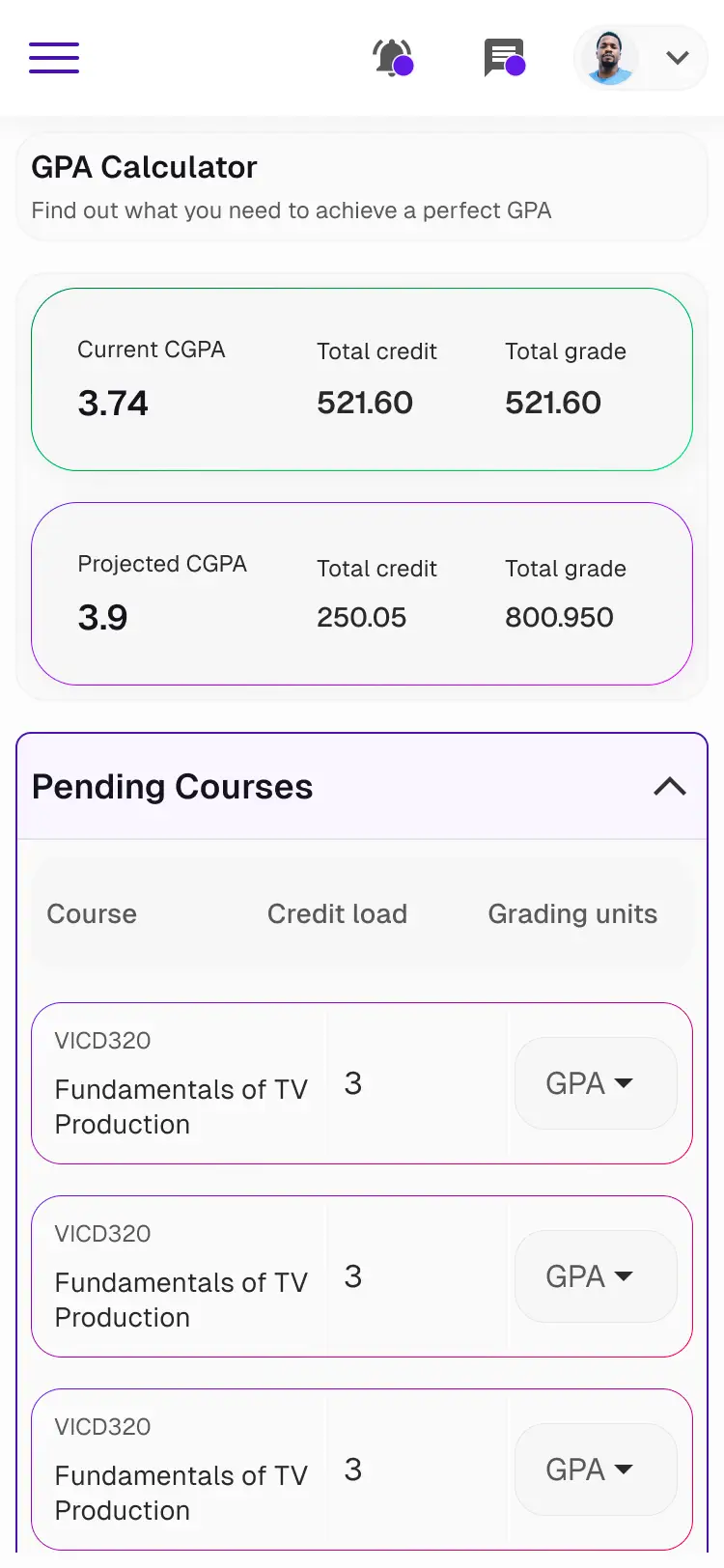
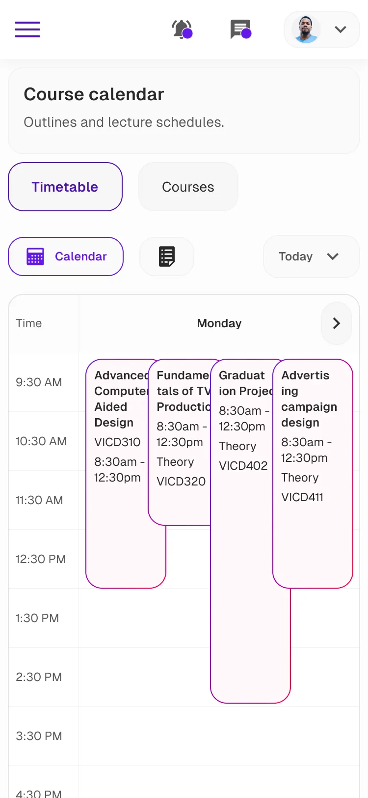
Easy course management
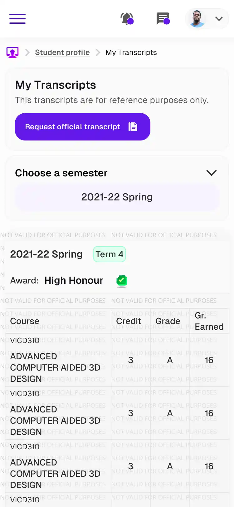
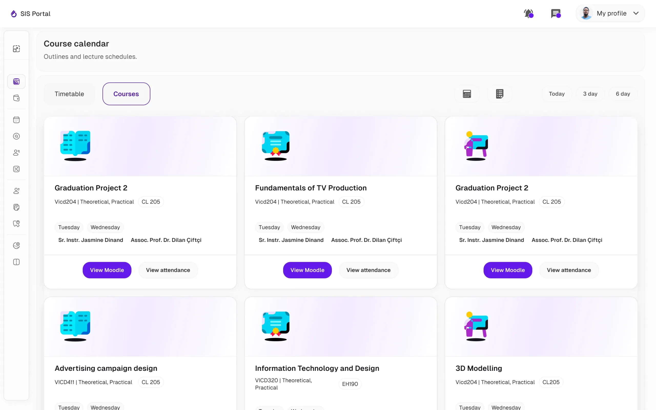
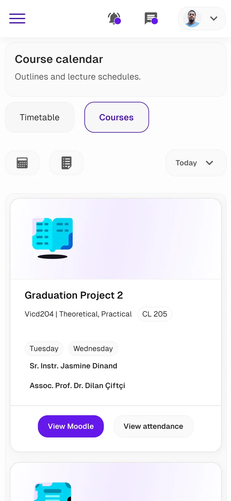
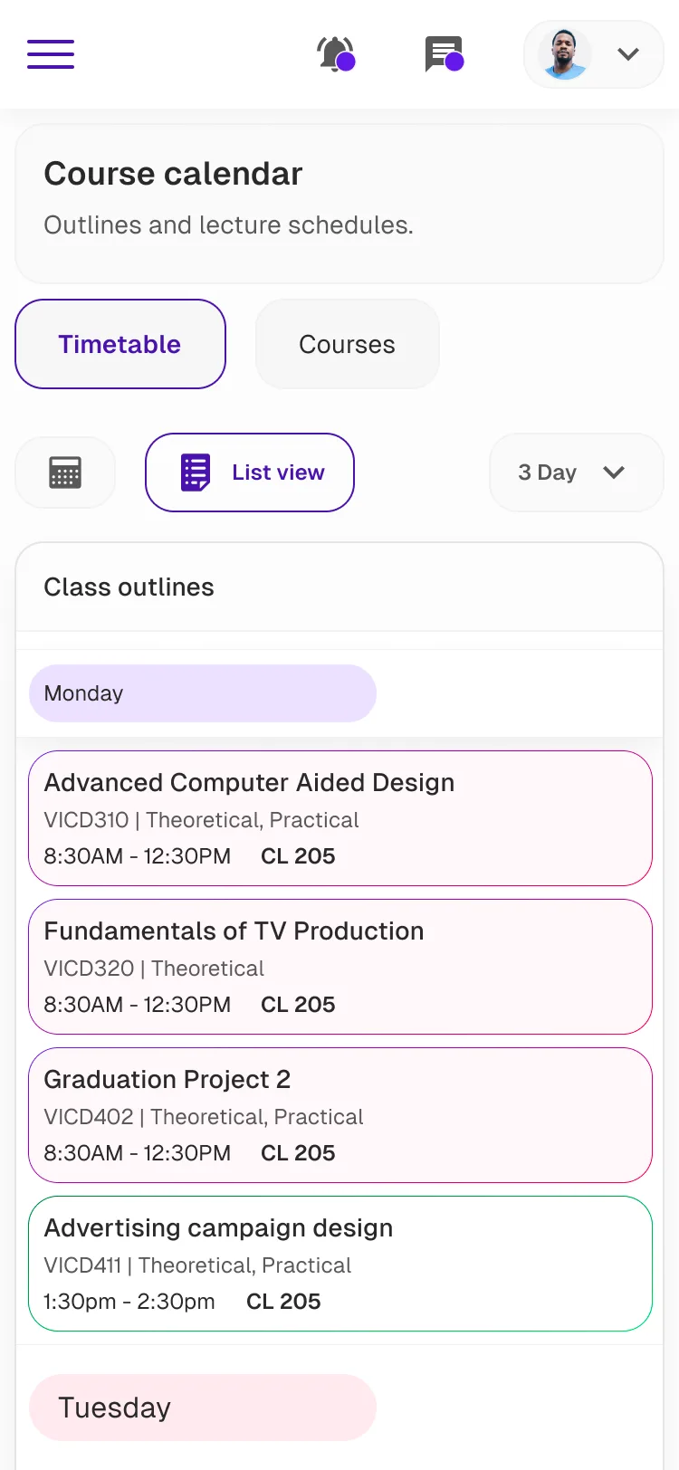
Provide a seamless experience to discover, explore, and manage courses and timetables effortlessly, offering multiple view options and quick access to all relevant links and key information at a glance.
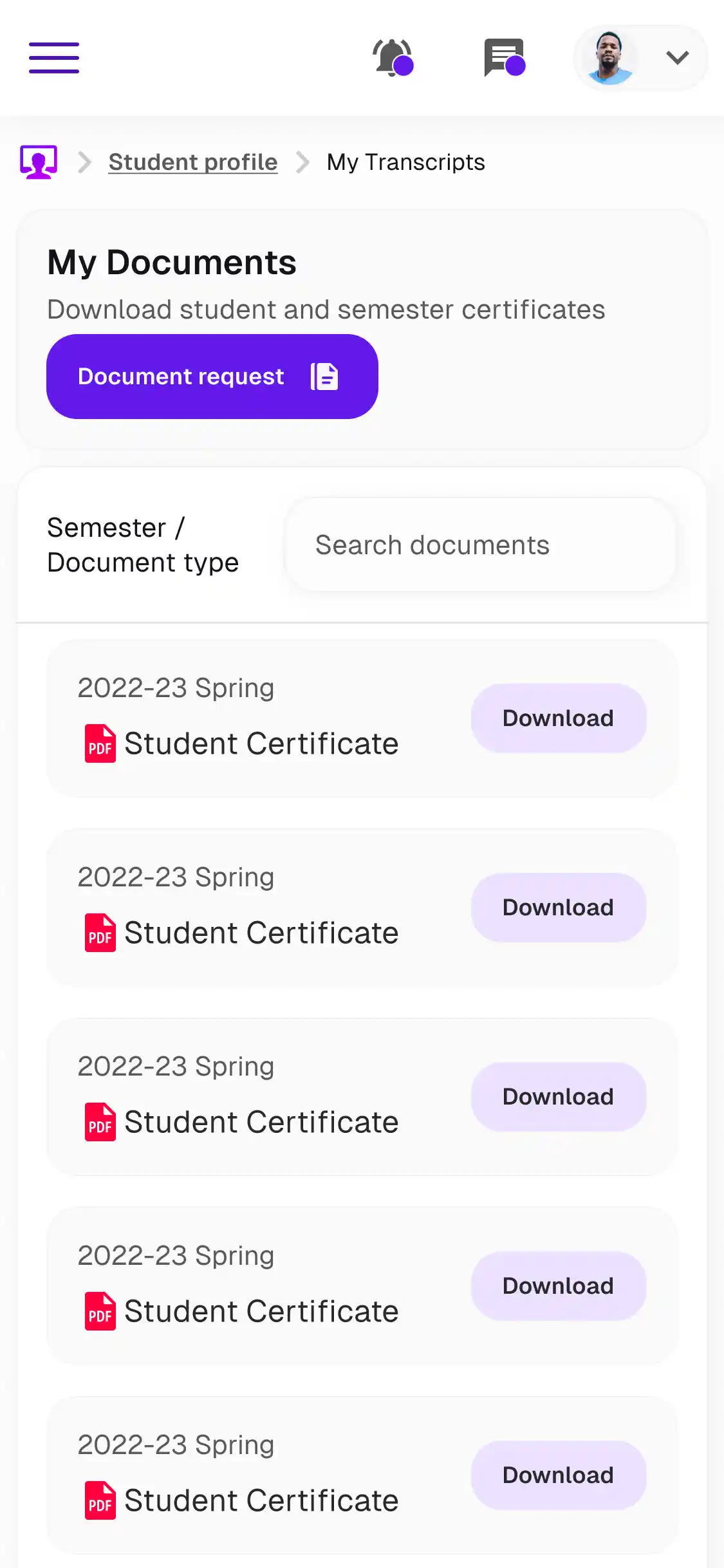
Tuition managment with easy
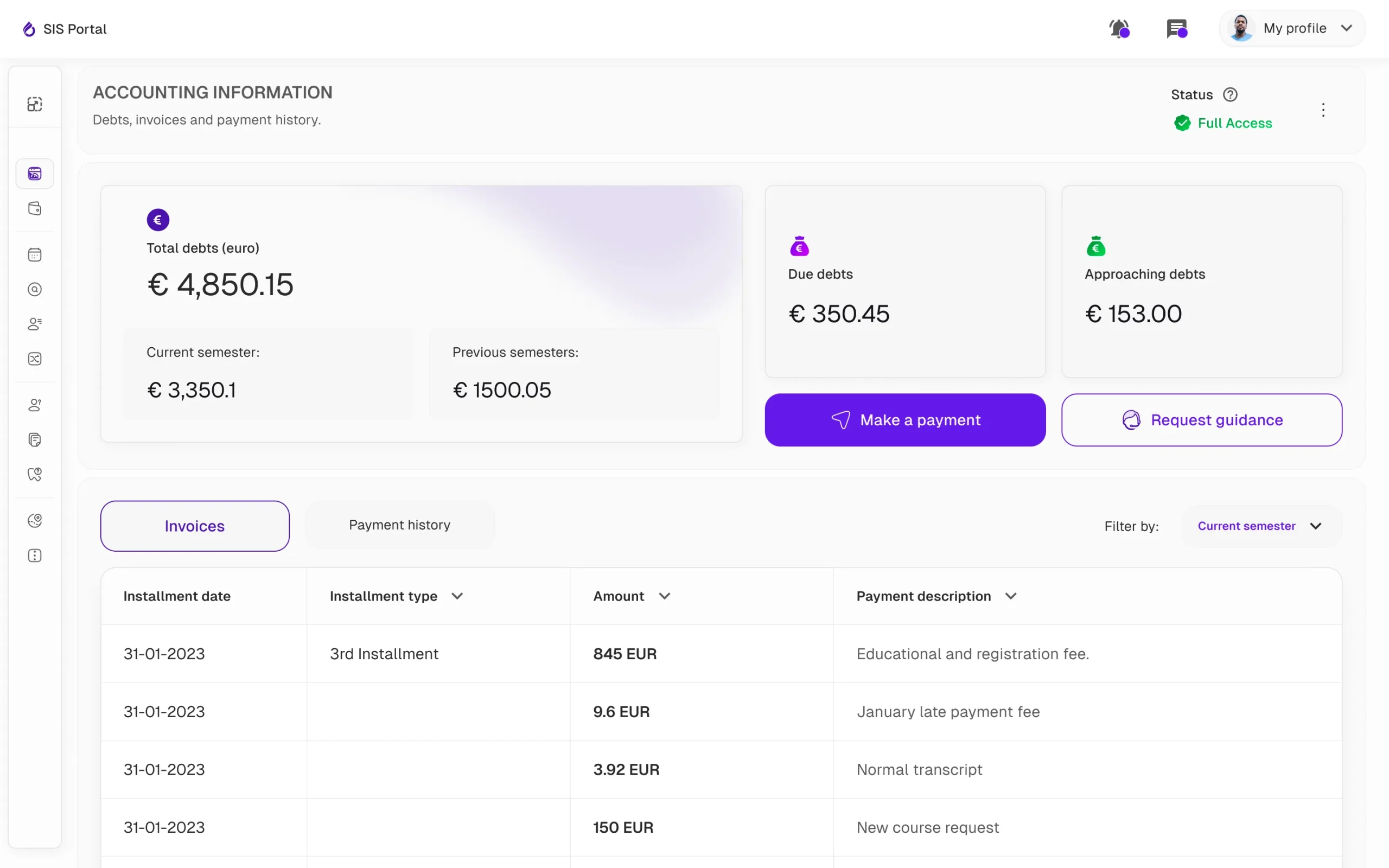
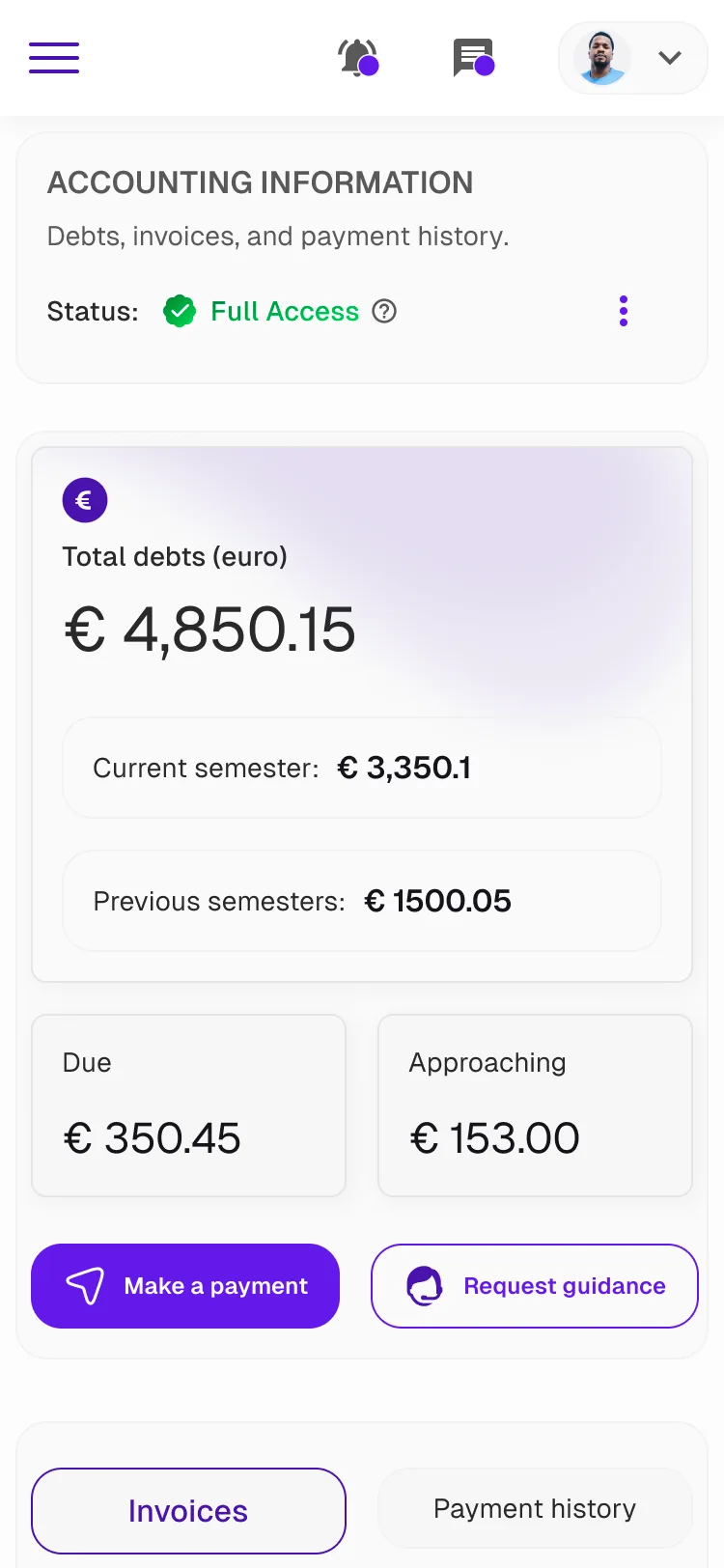
Streamline finance and tuition management with clearer language, detailed debt breakdowns, and visible access controls.
